To decrease discrimination against women, Fearce brewery provides a safe place for women to interact with another. They can support each other through educational and professional training to develop leadership skills. I developed brand positioning to reach out to an untapped market.
Sector: Brewery
Role: Graphic Designer
Project Type:
Branding, Packaging Design
Deliverables: Logo Design, Packaging
Design, Retail Assets
Fearce Brewery

Context
Fearce Brewery Co. is a fictional co-op brewery created as a place for young women to socialize, get professional training, and drink beer together. The purpose of the project is to empower and protect women from sexism, misogyny, and assault that they face from the craft beer industry. Playing with two contrasting words, the brand name “Fearce” is a combination of the words fears and fierce which means to not be scared. The brand empowers women to speak up and be confident.

Method
I researched articles about the issues of women working at craft breweries which is historically dominated by men. According to the research, only 7.5 per cent of brewers were women and women made up 37% of employees in non-service roles. I also found out that there are very few breweries run by women and my brewery stands out for being the only brewery that supports women’s initiatives.


Solution
Logo Design
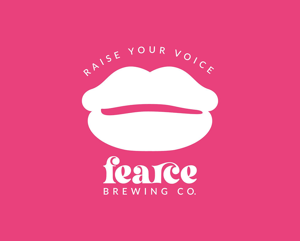
I created a logo based on the shape of a lips to represent the voice of women. With a spin off of the phrase “Raise your glass,” the tagline “Raise your voice,” encourages women to talk and raise awareness on womens’ rights.
The logo and tagline "Raise your voice" encourages women to speak up.
Packaging Design
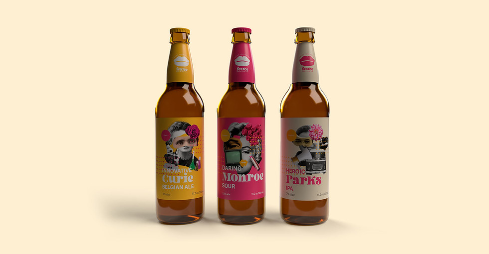
I designed the packaging series called the Girls Got Grit that celebrates women’s against social expectations. The three beer labels featured Marilyn Monroe, Marie Curie, and Rosa Park. All of these ladies are well-known during different eras and from various fields.


Takeaways
Throughout the design process, I discovered the importance of researching both the beer types and their flavors when creating labels. It became essential to match the flavors with the personalities of the featured women, ensuring the labels reflected both elements cohesively.


