Why Clores Design Studio believes lifestyle brand founders deserve more than a beautiful logo?
June 9, 2026
What rebuilding the studio’s own identity revealed about clarity, positioning, and the real reason customers trust or don’t trust your brand
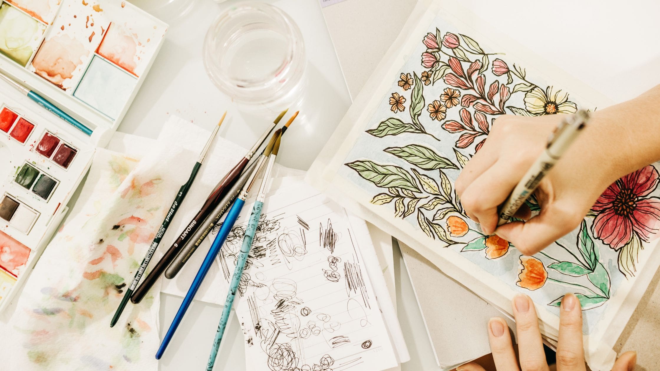
Everyone draws flowers. I did it anyway.
It’s 11pm and I amis still at my desk, sketchbook open, pencil moving. The page is covered in petals. Five-petalled shapes, six-petalled shapes, petals with curves and petals with points, petals arranged tightly and petals with space between them. And I keep stopping. Not because the drawing is wrong, but because I know what the page is full of.
Flowers. Again. Everyone draws flowers.
They are on every mood board, every feminine brand, every studio that wants to say soft and considered without quite knowing how. I have seen hundreds of them. I have probably helped a client avoid them. And now here I am, at 11pm, drawing them myself, because the flower means something to me. Not as a motif. Not as a trend. As something older than that.
This is the particular difficulty of designing for myself. I know all the rules. I know which directions are overused and which references are tired. I can articulate, with great precision, why someone else’s choice is the wrong one. And then I sit down with my own sketchbook and discover that every instinct I have pulls me toward something I would tell a client to reconsider.
Sitting with clients taught me that it is not a design problem.
Rebranding Clores Design Studio wasn’t really about the logo, in the end. It was about something that took longer to name: the gap between the designer I was and the designer I had become. A year ago, I understood design as a craft problem. I have a visual challenge; I solve it. I have a creative brief; I respond to it. The measure of good work was whether it looked right.
What I understand now is different. I’ve sat with enough founders: women building lifestyle businesses, brands with real stakes behind them, people who have poured years into a product or a service, to know that design isn’t a craft problem. It’s a business problem that requires a creative solution. When a brand looks cheap, customers don’t trust it. When a brand can’t communicate what it stands for, customers don’t buy. When a brand has no clarity about who it’s speaking to, no amount of beautiful visual work will make up the difference.
I know that now in a way I didn’t before. And the old version of the studio, the one that existed before this rebrand, didn’t fully reflect it.
“The hardest part wasn’t making design decisions. It was admitting what I actually believed, and then finding the courage to make that visible.”
How do you build a brand that does both emotion and strategy?
The problem I was trying to solve wasn’t aesthetic. It was positioning. I needed to understand how to build a brand that could hold two things at once: the emotional dimension of design such as the storytelling, the cultural depth, the tactile quality that makes work feel meaningful, and the business dimension, the part that actually helps a lifestyle brand grow, attract the right customers, and communicate its value in a market where looking good is no longer enough to stand out.
These two things can feel like they pull in opposite directions. Emotion and strategy. Story and system. Feeling and function. A lot of studios choose one. The work I’ve been doing with clients has convinced me that the choice is a false one. A brand without emotional resonance is forgettable. A brand without strategic clarity is invisible. The work that actually moves a business forward is both.
Learning to communicate that, first to myself, then through the studio’s identity, was harder than I expected. Brand positioning isn’t something you do once and then move on from. It’s a question you keep answering, in different rooms and different formats, until the answer becomes second nature.
When your brand says premium, everything else has to catch up, not just your logo.
And then there is what the rebrand turned out to actually be about, which wasn’t only the brand at all. It was the whole studio. The logo was the visible part. Underneath it: a more streamlined way of working with clients. Clearer positioning that lets me speak directly to the founders who are ready for this kind of work. Pricing that reflects the value of strategy alongside execution. A client experience that is built through Honeybook, a proper portal, and a thoughtful onboarding, that makes the invisible parts of the work visible.
Because that’s the thing about rebranding that nobody tells you upfront. You don’t just get a new logo. You get forced into clarity about everything else. If your identity is going to hold, your entire way of operating has to hold with it. The brand can’t say premium if the client experience says figuring it out as I go. The work can’t promise emotional resonance if the studio behind it hasn’t done its own emotional work.
Which brings me back to the sketchbook. And the flowers. The logo that emerged from those late nights is drawn from the Sampaguita — the national flower of the Philippines, the flower that my grandmother would have known, the one offered in churches as a symbol of care and purity and something worth holding gently. The name Clores comes from Flores. From flowers. It was always going to be a flower. The question was just whether I was brave enough to mean it.
I think that’s what rebranding really is, in the end. Not a new look. A decision to mean what you say.
Clores Design Studio is now booking projects in branding, packaging, and website design for purpose-driven lifestyle brands.
